Objetivos da DCS
Aplicar técnicas de dataviz para plotagem e manipulação de representações visuais de distribuições.
Elaborar RVs para dados de censo (Fonte: UCI ML Repository)
CSV disponível no kaggle.
Ferramentas utilizadas
Módulos Python
pandasmatplotlibseaborn
Aplicação do modelo referencial
Vide Capítulo ??.
import pandas as pd
import seaborn as sb
import matplotlib.pyplot as plt

plt.style.use('../etc/gcpeixoto-datavis.mplstyle') # style sheet
Dados de entrada pré-processados
Carregamento de dados
df = pd.read_csv('../data/adults.csv',skiprows=1)
dfVisualização de distribuições univariadas
Podemos usar
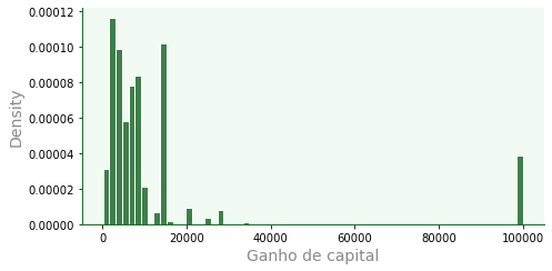
seaborn.displotpara plotagens gerais de distribuições:kind=hist | kde | ecdfplotará histograma, ou kernel density estimation, ou ECDFrowecolexpandem plotsA inclusão de
yehuegerará RVs similares a mapas de calor ou, proporções, quando hue for categórico.
dfa = df[df['capital_gain'] > 0]

# f é figure level
f = sb.displot(data=dfa,
           x='capital_gain',
           color='#005610',
           edgecolor='w',
           linewidth=1,
           kind='hist', # hist | kde | ecdf
           #row='race', # faz outros plots por linha
           #col='sex', # faz outros plots por colu
           stat='density', # count | frequency | density | probability | percent | proportion
           height=3.5, aspect=2 # aspecto usa proporção de altura
           )

# remover grid
for ax in f.axes.flat:
    ax.grid(False)
    ax.set_xlabel('Ganho de capital')
KDE e superposição
Com
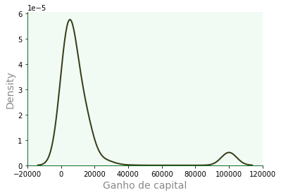
kdeplot, temos a curva estimada por núcleos, a qual pode ser superposta ao histograma por meio deax.
f2 = sb.kdeplot(data=dfa,
           x='capital_gain',
           color='#232a00',
           fill=False,
           alpha=0.9,
           #ax=f.ax # habilite para sobrepor
           )

f2.grid(False)
f2.set_xlabel('Ganho de capital');
Distribuição cumulativa
Distribuições cumulativas empíricas podem ser plotadas com
ecdfplot.
f2a = sb.ecdfplot(data=dfa,
           x='capital_gain',
           color='#006633',
           alpha=0.8,
           linewidth=1.0,
           ls=':',
           marker='o',
           markersize=5,
           markevery=60
           #ax=f.ax # habilite para sobrepor
           )

f2a.grid(False)
f2a.set_xlabel('Ganho de capital');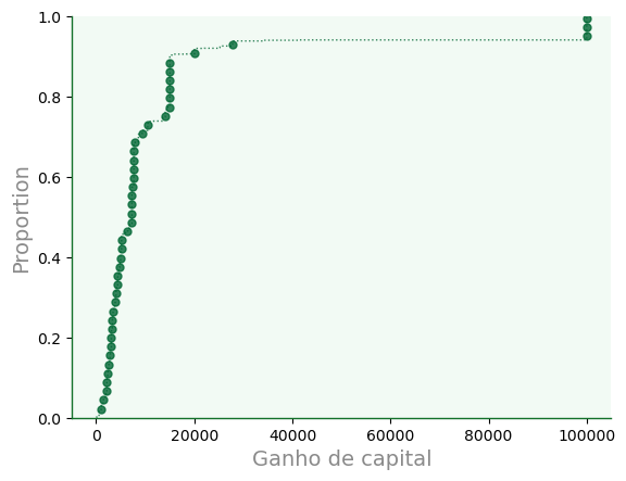
Plot tapete (ou borla)
O
rugploté uma representação visual que adiciona traços similares a ticks no gráfico. O nome “rug” (tapete) deriva da lembrança de um tapete aberto com suas borlas (franjas) destacadas.Também podemos construir rugs com a keyword
rugemdisplot.
f3 = sb.rugplot(data=dfa,
           x='capital_gain',
           color='k',
           linewidth=1,
           height= 0.3,
           )

f3.grid(False)
f3.set_xlabel('Ganho de capital');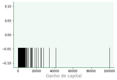
Superposição de borlas
f4 = sb.displot(data=dfa,
           x='capital_gain',
           color='#005610',
           linewidth=1,
           kind='kde',
           height=3.5,
           aspect=2,
           rug=True,
           rug_kws={
               'height': 0.2,
               'color': 'w',
               'linewidth': 0.5,
               'alpha': 0.5,
           }
           )

for ax in f4.axes.flat:
    ax.grid(False)
    ax.set_xlabel('Ganho de capital')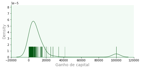
Outros visuais
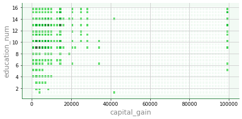
Mapa com displot
f5 = sb.displot(data=dfa,
           x='capital_gain',
           y='education_num',
           color='#005610',
           edgecolor='w',
           linewidth=1,
           height=3.5, aspect=2 # aspecto usa proporção de altura
           )
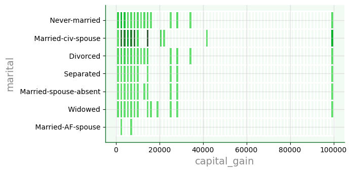
f6 = sb.displot(data=dfa,
           x='capital_gain',
           y='marital',
           color='#005610',
           edgecolor='w',
           linewidth=1,
           height=3.5, aspect=2 # aspecto usa proporção de altura
           )
Distribuições bivariadas
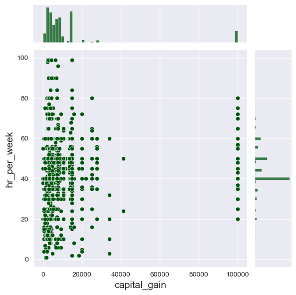
Usamos
jointplotpara exibir densidades a partir de relações entre duas variáveis.Controle o tipo com
kinde ohue
sb.set_style('darkgrid')
f7 = sb.jointplot(data=dfa,
           x='capital_gain',
           y='hr_per_week',
           color='#005610',
           height=6,
           #hue='sex'
           kind='scatter' # 'scatter', 'hist', 'hex', 'kde', 'reg', 'resid']
           )
sb.set_style('darkgrid')
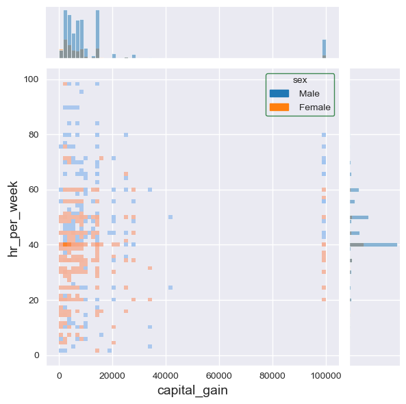
f7a = sb.jointplot(data=dfa,
           x='capital_gain',
           y='hr_per_week',
           color='#005610',
           height=6,
           hue='sex',
           kind='hist' # 'scatter', 'hist', 'hex', 'kde', 'reg', 'resid']
           )
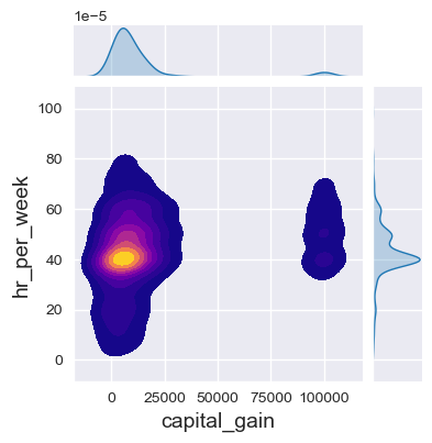
f7c = sb.jointplot(data=dfa,
           x='capital_gain',
           y='hr_per_week',
           height=4,
           kind='kde', # 'scatter', 'hist', 'hex', 'kde', 'reg', 'resid'],
           fill=True,
           cmap='plasma'
           )
Usamos
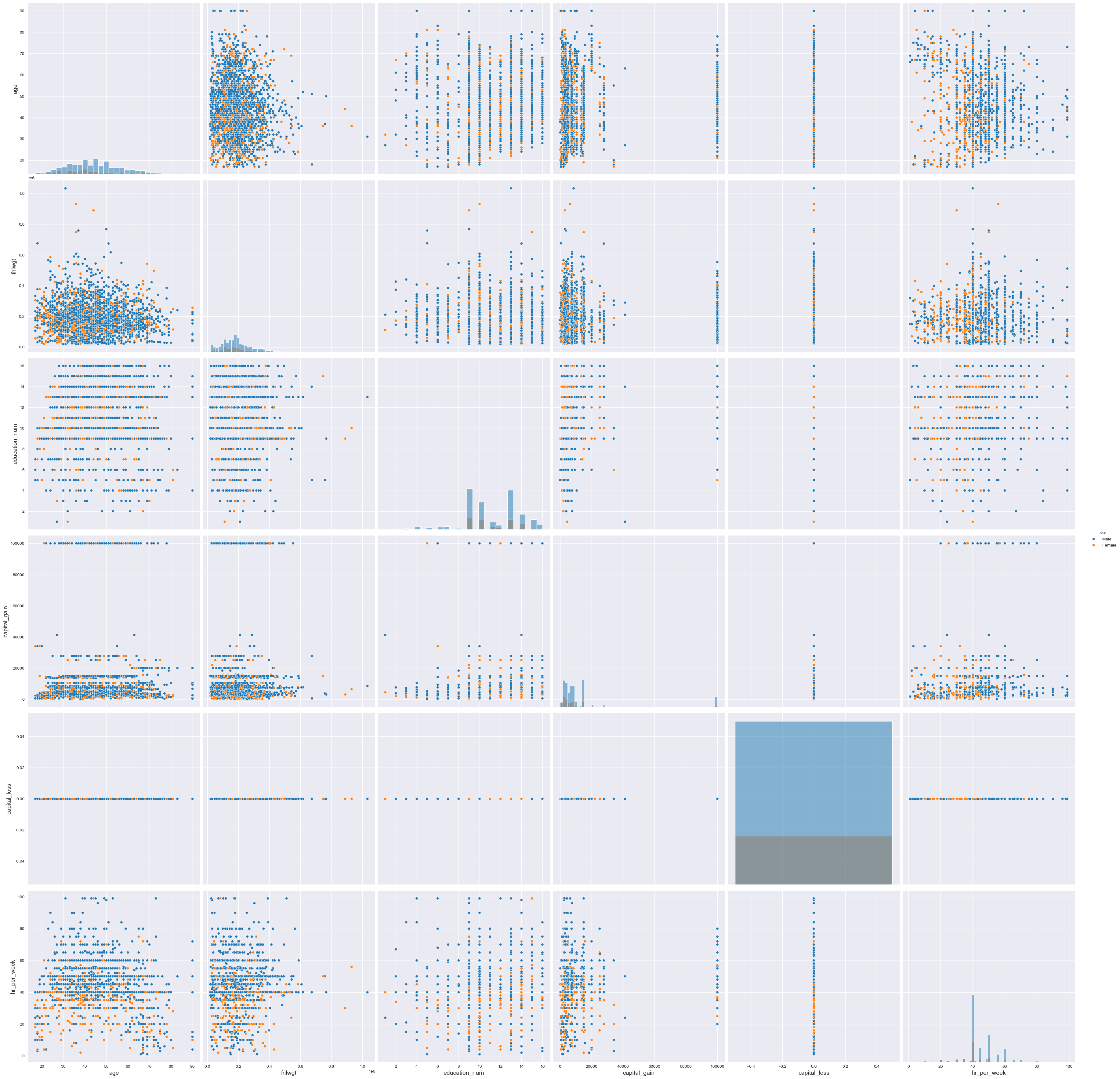
pairplotpara realizar plotagens de pareamentos em forma matricial
f7d = sb.pairplot(data=dfa,
           height=6,
           hue='sex',
           kind='scatter', # 'scatter', 'hist', 'hex', 'kde', 'reg', 'resid'],
           diag_kind='hist'
           )